

Don't try to imagine. Don't try to create. Simply do it. Just pick up something and start. Don't agonize over perfection; don't worry about it being "good." Remember: You can always start over. Create. Put YOU in the world.
Saturday, April 2, 2011
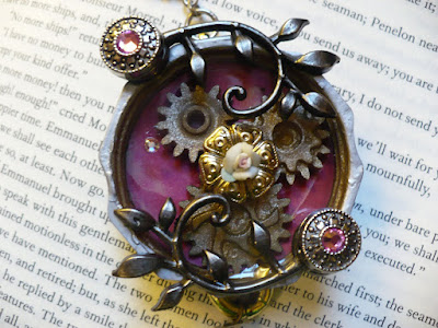
This is Steampunk
This is an image that I borrowed from Crafty Bitch (she's got a blog here) and it's a GORGEOUS example of Steampunk. The very cool thing about Steampunk is that if you do it RIGHT, you're recycling. It can be very green! What I really like about this piece is that it's not over-industrialized. She's created an excellent balance between Victoriana and Industrial. Some who believe themselves to be "Steampunk Purists" maintain that it has to be all edgy and streamlined industrial with just a few flourishes of Victorian embellishment, but I disagree. As with any art form, it is what YOU want it to be.
Steampunk 101
Below is a link to information regarding the ongoing craze for Steampunk. Steampunk is an astonishing and lovely amalgamation of Victoriana and Science Fiction. The article below describes and defines it and provides some very cool images. Steampunk is funky, fun, and while the images in the article take it to an extreme, it is a very effective jewelry statement. Read on and then visit ArgentSol - Steampunk Findings to purchase the REAL thing - vintage jewelry findings that can be used in infinite ways to create interesting and unique pieces of Steampunk Jewelry. While this is a trend right now, my belief is that it will not be something that goes out of style with regard to jewelry, if pieces are constructed with an eye toward elegance and minimalism, and NOT over-done. If they are made correctly, and with quality components, these are unique pieces you will be able to hand down and they will be one-of-a-kind. Have fun reading and shopping. I'll be posting some Steampunk tutorials here soon.
Steampunk 101 | tor.com | Science fiction and fantasy | Blog posts
Steampunk 101 | tor.com | Science fiction and fantasy | Blog posts
Thursday, March 31, 2011
Okay - I Never Claimed To Be Able To Paint...
But I wanted to see what I could do with alcohol inks and a paint brush. This is my 3-second landscape. Yeah, I know - it sucks. But the point of the exercise was to see if I could use paint brushes with alcohol inks .
.
It can be done! I daubed the background in, and then I put three or four colors on a dauber felt, making sure they didn't blend with one another and a few drops of blending solution on a corner of the felt by itself. I then used a tiny stiff brush and stroked in a few trees and birds and something that appears to be a path but has zero perspective. So sue me. LOL!
The entire point though, was to prove the potential of these inks. The tile below (which will be re-done) is my experiment. It's a lousy photo - too much flash,and the colors just don't show as well as they should - but you get the idea with it. This is my 3-Second Bad Landscape Tile. Yes, my work-space is a wreck, but oh well. :)

Here it is with some blending solution applied and the "path" blended out - see how easy it would be to make a rocky outcrop? I can see that as rocks after I've done a little work with it. :)

And this is with the entire image blended out and a paint brush swirled across it. The blending solution with completely remove the ink if I want to do that:

Alcohol Ink. More Alcohol Ink. Someone Stop Me Before...
Everything in my house is faux-finished with alcohol ink. So I started this table the other day. I'd already done one in browns and golds. It came out lovely. I decided to try for a marbled effect. It worked okay until I started on the apron of the table. I'm going to paint over that with white. I think the table will be lovely with just the top finished. I used Ranger Adirondack Alcohol Inks in Pitch Black , Rust
 and Gold
 .
.
I used the felt dauber and daubed around the arc of the table, constantly blending with Adirondack Blending Solution . You don't need much of it. Once I had the color on, I "marbled" simply by drizzling the Blending solution randomly across the table. Again, less is more. Do a little and see how it looks. It's very easy to get splotchy with this solution. :)
I like it. Comments are welcome. Remember, I'm painting over the "apron" of the table, which is why that appears unfinished.

I used the felt dauber and daubed around the arc of the table, constantly blending with Adirondack Blending Solution
I like it. Comments are welcome. Remember, I'm painting over the "apron" of the table, which is why that appears unfinished.

Sunday, March 27, 2011
Found Items Note Card
I got inspired this morning by a bag of paper birch bark that I'd pulled from a log while staying in the White Mountains of NH a few years ago. The card below is a product of my (rather fertile) imagination this morning. Here's what I did to make it.
1. Cut beige cardstock to size.
2. hand-rubbed Ranger Distress Ink in the color Vintage Photo using a cotton pad and large swirling motions. You don't want the rubbing to look splotchy.
3. I then added a layer of Adirondack Dye Ink in Butterscotch
4. Keeping the cardstock flat, with the edge just barely over my table (make sure your table is protected or that you don't care if it gets marred, because this technique will mar your table!) and used a Diamond-Coated Lapidary Needle File in an upward motion to distress the edges of the cardstock. This can be tricky - you need to apply pressure, but not enough to tear the card - you want to sort of "soften and shred" the edges.
5. I then took my ink pad in Vintage Photo and inked all the way around the distressed edge of the cardstock.
6. I used a scribe to score the area of the card where I was going to place the birch bark "frame" and then using a glue gun, glued the birch bark on top of the scored area.
7. The picture that is framed by the birch bark is a stamping that I hand-colored using Prismacolor Colored Pencils .
.
8. After coloring the stamping, I used a Tape Runner on the back of the stamping and affixed it to the cardstock in the center of the birchbark frame. You can use any kind of tape-runner, but I've found that you get what you pay for. If you buy a good tape runner, your stuff will stay stuck. If you don't, it'll fall apart. :)
9. I had some 30 ga copper sheet that I'd embossed for a project about a year ago and never used, so I cut it down (it's easily cut with scissors) and just used a glue gun to attach it to the card stock.
I still need to trim the birch bark, which I'll do with nail scissors, but this card is gorgeous in person. The photo, I think, makes it look a bit messy, but up close, holding it in your hand, it's (if I do say so myself) truly a one-of-a-kind and very pretty! Here's the "almost finished" image:

1. Cut beige cardstock to size.
2. hand-rubbed Ranger Distress Ink in the color Vintage Photo
3. I then added a layer of Adirondack Dye Ink in Butterscotch
4. Keeping the cardstock flat, with the edge just barely over my table (make sure your table is protected or that you don't care if it gets marred, because this technique will mar your table!) and used a Diamond-Coated Lapidary Needle File
5. I then took my ink pad in Vintage Photo
6. I used a scribe to score the area of the card where I was going to place the birch bark "frame" and then using a glue gun, glued the birch bark on top of the scored area.
7. The picture that is framed by the birch bark is a stamping that I hand-colored using Prismacolor Colored Pencils
8. After coloring the stamping, I used a Tape Runner
9. I had some 30 ga copper sheet
I still need to trim the birch bark, which I'll do with nail scissors, but this card is gorgeous in person. The photo, I think, makes it look a bit messy, but up close, holding it in your hand, it's (if I do say so myself) truly a one-of-a-kind and very pretty! Here's the "almost finished" image:

More Note Cards, Less Cold
The cold abated for a bit and my eyes aren't streaming from allergies so I attempted something simple. I totally screwed it up, and any "professional" stamper will see where. (snort!) But It's actually quite pretty, simple, and the design could be altered to be blank note cards. I used a set of acrylic stamps, and Colorbox inks on this one. For the bottom edge, I used Martha Stewart's doily hole punch which takes a bit of getting used to. Once I figured out how to use it it was simple, though.


Saturday, March 26, 2011
Got a cold!
More coming folks, once I get over this daggoned cold! Right now I'm drained of energy; I'm sniffling and sneezing so that even my cats don't want to be around me, my sofa has a permanent impression of my hindquarters and my dvd remote control "play" button is wearing thin. It's part cold, part allergies, part driving myself too hard, so I'm taking a bit of a break. Be back in a couple of days!
Maureen aka ArgentSol.
:)
I did, however, manage to create one thing today. I made a note card. It's not quite finished because the center piece needs a border and I'm thinking of adding some thin velvet ribbon.
I used Colorbox inks for the stamping, distressed the edges of it after cutting it out, heavily inked the distressed edges, glued it on, punched a 1//16th" hole at the top for the little filigree butterfly (which had a bend-over top - it's a vintage jewelry finding) and then inked the edges of the card. It's actually a dark burgundy - not the "purple" it appears on my monitor. Here it is:

Subscribe to:
Comments (Atom)